
I've started to shoot people on the street. Um, out of context that probably sounds really really bad. I mean I'm into street photography. Right now I do not have the guts to sidle right up to people and I don't have a long lens so a lot of the shots are like this one - from behind. Once I get my new digital with a 100-400mm telephoto zoom lens I'm planning on taking a stronger approach. Feel free to comment.
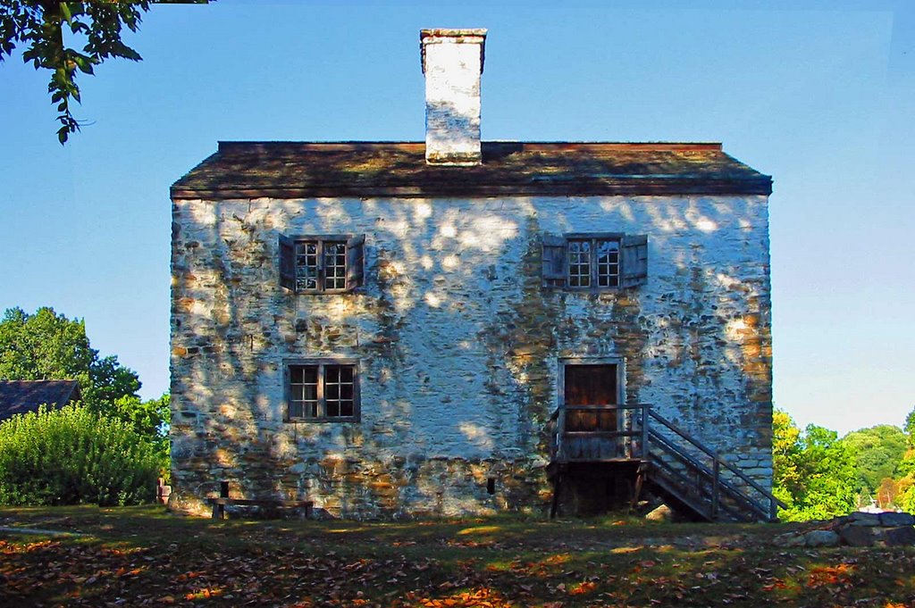
The picture of this building on the Phillips Manor grounds in Sleepy Hollow has been sitting in a CF card since the summer of 2005. The original had a decent amount of parallax I tweaked out in Photoshop. I boosted the saturation a bit as well and tweaked the shadow/highlights. The lower right portion of the horizon could have benefited from a circular polarizer. Feel free to comment.
I've entered a gallery exhibition that kicks off April 1st and I'm trying to figure out if I want to use any of my digital work, some of my black and white prints or what. The exhibition is no big deal, it's open to any member of the Westchester Photographic Society. All I needed to do was add my name to a list. Even so, its fun just going through the process of evaluating my limited body of work and then matting and framing it for people to see. It's a small step but a very important first one.

2 comments:
Like the first one. Says a lot without showing a person's face. Nice. The second one seems too symmetrical. In my limited art schooling (1 class in college), I remember going over how a picture should never be perfectly centered.
Yep. The color is good and there are some interesting patterns but it is a bit blocky. But then again, it's a building.
It's not unusual for things to be centered in a picture, and it definitely can work out.
Not this time though.
Anyone else agree or disagree?
Post a Comment